Hi, I’m Bonny Elangbam. I’m a technical SEO architect and WordPress specialist with a passion […]
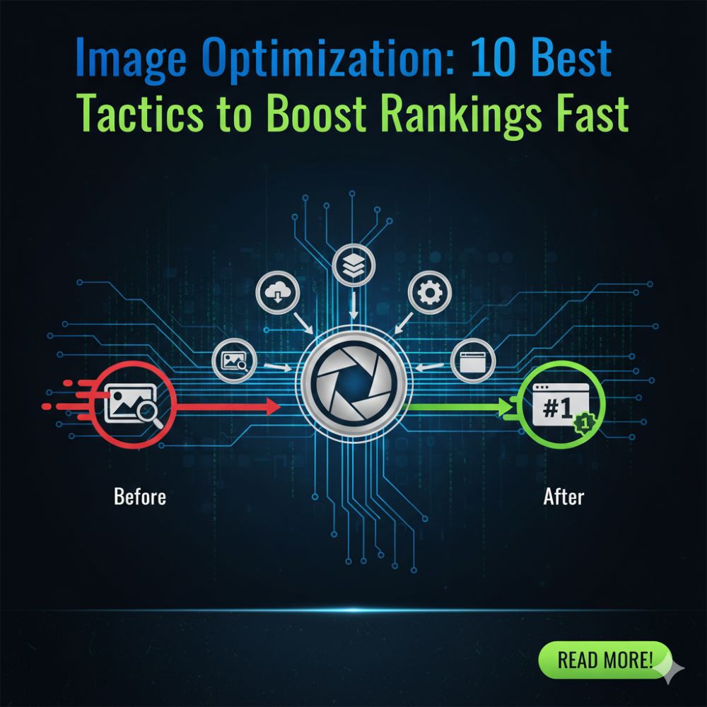
Image Optimization: 10 Best Tactics to Boost Your Rankings Fast
Hi, I’m Bonny Elangbam. As a web performance specialist and digital strategist, I’ve spent the […]
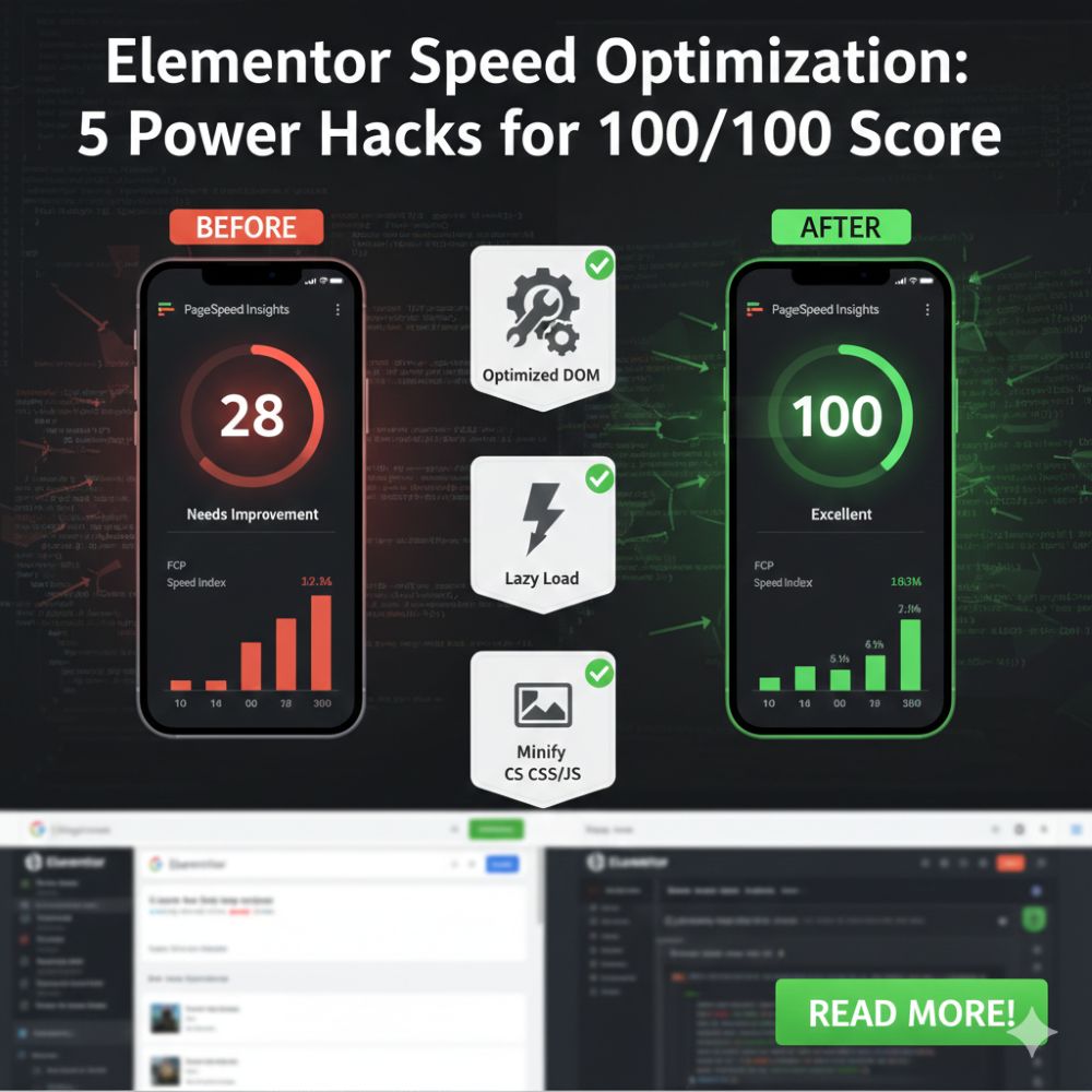
Elementor Speed Optimization: 5 Power Hacks for 100/100 Scores
Author’s Note Hi, I am Bonny Elangbam. Elementor isn’t slow by default; it is only […]
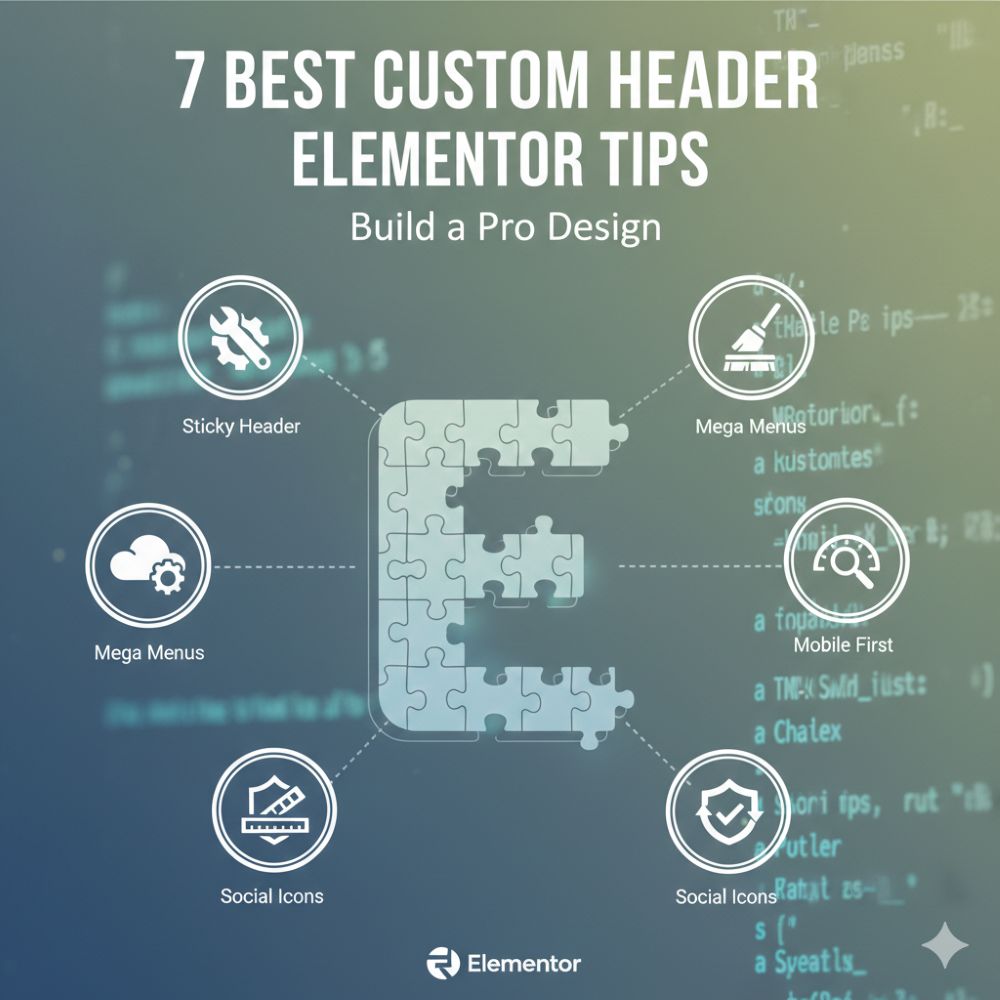
Custom Header Elementor: 7 Easy Steps to Build a Pro Design
Hi there! I’m Bonny Elangbam. As a web designer who has spent years tinkering with […]
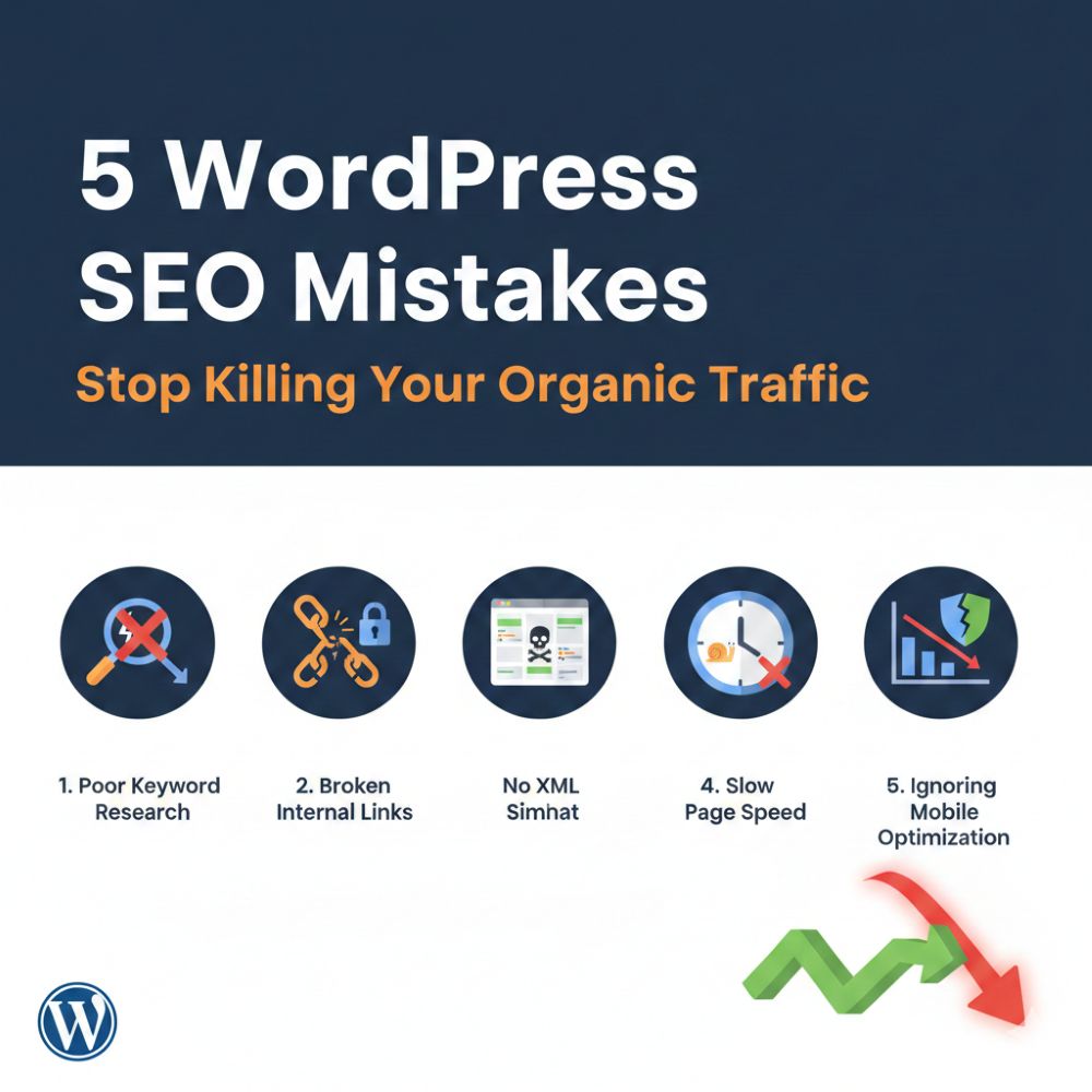
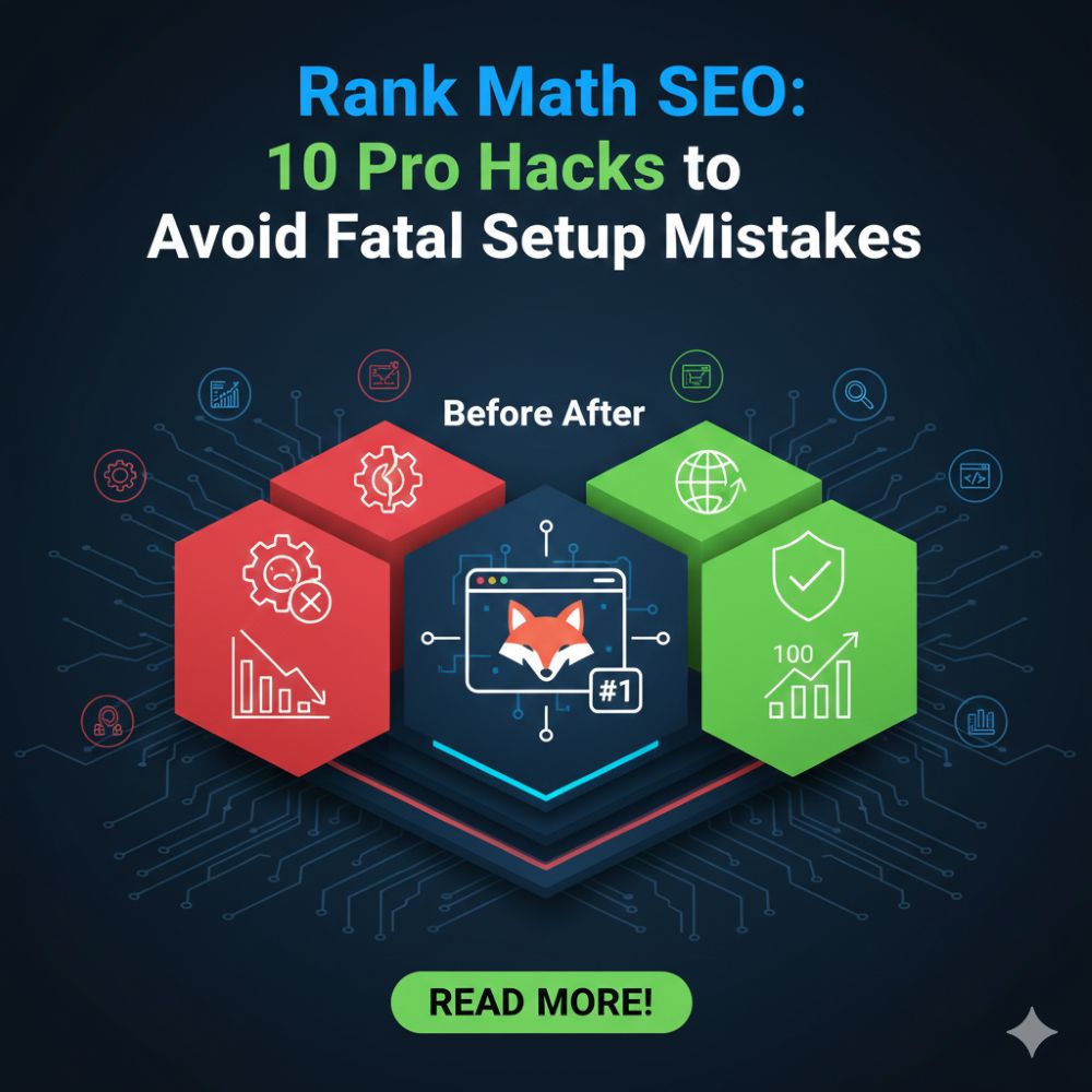
5 WordPress SEO Mistakes: Stop Killing Your Organic Traffic
Hello there! I’m Bonny Elangbam, and I’ve spent the better part of a decade navigating […]
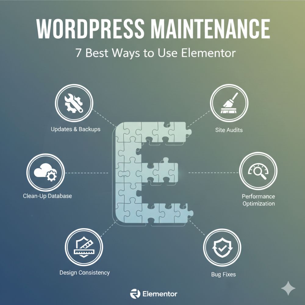
How to Use Elementor to Set Up a WordPress Maintenance Page
Hey there! I am Bonny Elangbam. If you’ve ever felt that mini-heart attack when your […]
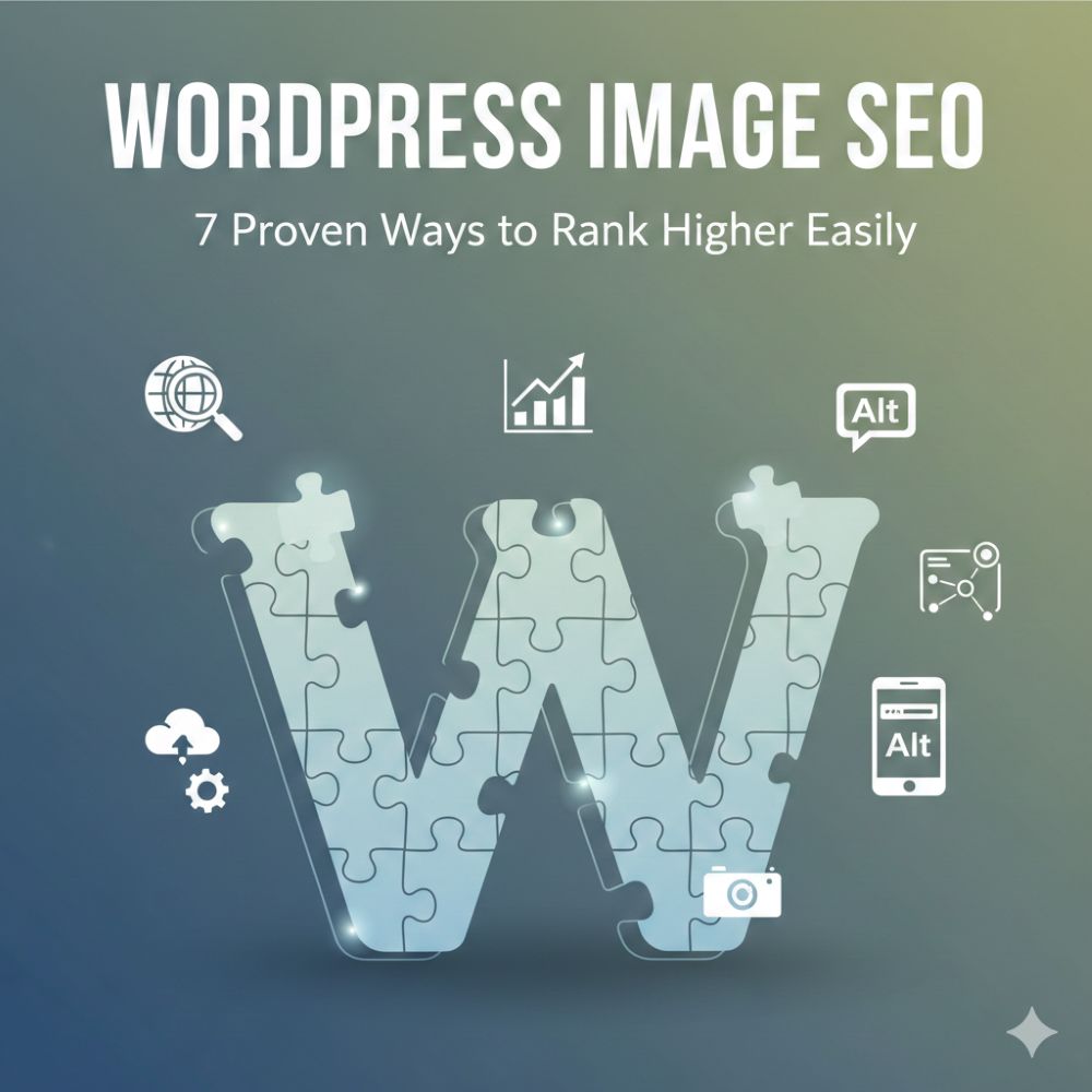
WordPress Image SEO: The Ultimate Guide to Higher Rankings
In the competitive world of digital marketing, visual content is king. However, most website owners […]
Top 5 Speed Engines: The Best WordPress Caching Plugins 2026
Why WordPress Caching Plugins Are the Pulse of Your Business in 2026 If you have […]
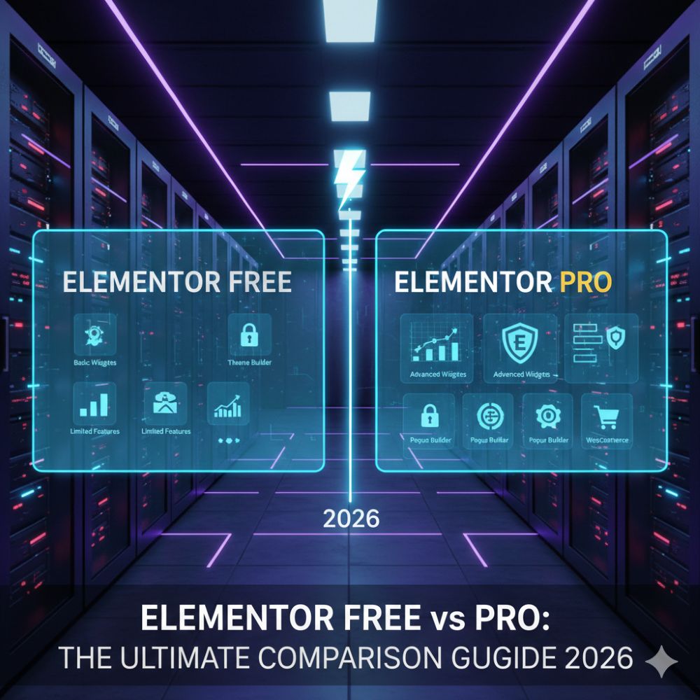
Elementor Free vs Pro: Why Your Choice Dictates Your Business Growth
Executive Summary: In a hurry? For 2026, Elementor Free remains the gold standard for basic […]
Elementor Flexbox Containers: Speed Up Your Workflow
I am Bonny Elangbam, a web developer with 11+ years in the industry, and I’ve […]