Hi there! I’m Bonny Elangbam. As a web designer who has spent years tinkering with WordPress, I know that the header is the “handshake” of your website. It’s the first thing people see and the main way they find their way around.
I wrote this guide to take the mystery out of the Custom Header Elementor process so you can stop settling for “good enough” and start building “wow.” This expanded guide dives deep into the technical and creative nuances to ensure you have every tool needed for success.
If you have ever felt limited by your WordPress theme’s default layout, you aren’t alone. I remember the frustration of wanting a transparent menu or a specific button placement, only to find my theme settings saying “no.”
That’s exactly why the Custom Header Elementor workflow is a game-changer for creators like us.
In this deep dive, I’m going to walk you through the exact process I use to build professional, high-converting headers. We aren’t just talking about a logo and a few links; we’re talking about a functional piece of art that works on every device.
When we talk about a Custom Header Elementor build, we are talking about taking full ownership of your site’s identity.
Why the Data Matters:
According to a study by WebFX, 94% of first impressions are design-related. Furthermore, research on navigation usability shows that sticky headers can reduce the time it takes to find a link by 22%, directly lowering your bounce rate.
Using a Custom Header Elementor strategy isn’t just about aesthetics; it’s about site performance and user retention.
Why You Need a Custom Header Elementor Strategy
Before we jump into the “how,” let’s talk about the “why.” Your header is the most viewed element on your site. If it’s clunky, your bounce rate will soar.
By using a Custom Header Elementor approach, you gain total control over the user experience (UX). You can add call-to-action (CTA) buttons, social icons, or even a search bar exactly where they make sense.
In the modern web, users expect a seamless transition between pages. If your header feels disconnected from the rest of your brand, trust erodes.
A Custom Header Elementor design allows you to maintain font consistency, color palettes, and interactive elements that standard themes often lock away.
The Benefits of a Custom Header Elementor Layout
When you move away from standard theme headers, you unlock:
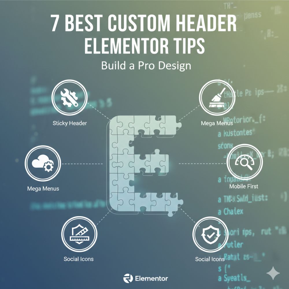
- Sticky Header Functionality: Keep the menu visible as users scroll.
- Dynamic Styling: Change the header color based on the page.
- Mobile Optimization: Create a completely different menu for phone users.
- Conversion Focus: Place high-priority buttons in the prime real estate of the screen.
Comparison Table
| Feature | Default Theme Header | Custom Header Elementor |
| Flexibility | Rigid; limited by theme settings | 100% drag-and-drop control |
| Mobile UX | Generic “Hamburger” menu | Custom-built mobile-specific menus |
| Sticky Effects | Basic Toggle (On/Off) | Advanced scroll-distance triggers |
| CTAs | Usually, none or one button | Unlimited buttons, icons, or forms |
7 Steps to a Pro Custom Header Elementor Design
1. Access the Theme Builder
To start your Custom Header Elementor journey, you need Elementor Pro. Navigate to Templates > Theme Builder. This is the cockpit of your website’s global elements. Click on ‘Header’ and then ‘Add New.’
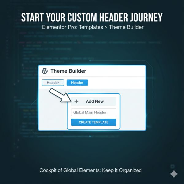
Name your template something descriptive, like “Global Main Header,” to keep your backend organized.
2. Choose a Template or Start from Scratch
Elementor offers beautiful pre-made blocks. If you’re in a rush, pick one! But if you want a truly unique Custom Header Elementor look, hit the ‘X’ and start with a blank canvas.
I personally prefer starting fresh to ensure every pixel aligns with my brand. A blank slate prevents “bloat” by only including the widgets you actually need.
3. Structure Your Sections
A pro header usually consists of a single section with two or three columns. Use the “Structure” tool to set widths.
- Left Column (approx. 20%): Your Logo (Site Logo widget). Always ensure your logo links back to the homepage; it’s a universal UX rule.
- Center Column (approx. 60%): Your Navigation Menu. This is the heart of your Custom Header Elementor build.
- Right Column (approx. 20%): A CTA button, search icon, or WooCommerce cart.
4. Style Your Navigation
In the Custom Header Elementor editor, drag the ‘Nav Menu’ widget into your center column. This is where the magic happens.
You can change the typography, hover effects, and the distance between menu items. I recommend using “Pointer” effects like a simple underline or background shift to give users visual feedback.
5. Perfecting Mobile Responsiveness
A Custom Header Elementor design that works on desktop but fails on mobile is ineffective. Use Responsive Mode to ensure the hamburger icon is easy to tap, menus don’t overlap content, and consider a slide-in menu for a cleaner, modern mobile experience.
6. Adding Sticky Effects
Want your header to follow the user? In the section settings, go to Advanced > Motion Effects. Set ‘Sticky’ to ‘Top.’ This is a staple of any Custom Header Elementor Pro build, as it keeps your navigation accessible at all times.
You can also toggle which devices it stays sticky on; usually, desktop and tablet are the priorities.
Pro Tip for Custom Header Elementor Sticky Effects
Use the “Effects Offset” (set it to around 100px). This allows you to apply custom CSS or built-in Elementor styles that make the header shrink or change color once the user starts scrolling.
It adds a layer of polish that screams “professional” and keeps the viewport clear for content.
Pro UX Rules for Headers
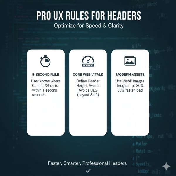
- The 5-Second Rule: A user should know exactly where your “Contact” or “Shop” page is within 5 seconds of landing.
- Core Web Vitals Tip: To avoid Cumulative Layout Shift (CLS), define a specific height for your header container. This prevents the page content from “jumping” once the header loads.
- Modern Assets: While I mentioned SVGs for logos, ensure any background images use the WebP format. This can reduce header-related load times by up to 30%.
7. Set Your Display Conditions
Once you’re happy, hit ‘Publish.’ Elementor will ask where you want to display it. For a standard Custom Header Elementor setup, choose ‘Entire Site.’
If you want a different header for your landing pages or your shop, you can create a second one and set the condition to specific categories or pages.
The Deep Dive: Maximizing Your Custom Header Elementor
To truly reach that professional level, we need to talk about the details that many designers overlook.
A Custom Header Elementor project isn’t finished just because the links work. We need to consider performance and accessibility.
Visual Hierarchy and Spacing
In my years as Bonny Elangbam, I’ve seen many headers fail because they are too “busy.” When designing your Custom Header Elementor layout, use negative space.
Give your logo room to breathe. Ensure your menu items aren’t touching the edges of the container.
Leveraging Dynamic Content
One of the most powerful features of a Custom Header Elementor build is the ability to pull in dynamic data. For example, if you are running a membership site, you can use the “User Info” widget to show the user’s profile picture directly in the header.
This level of personalization is what separates a basic site from a premium platform.
Advanced Custom Header Elementor Tweaks
For those who want to go further, consider adding a “Top Bar.” This is a thin strip above your main header for announcements or contact info.
Integrating this into your Custom Header Elementor workflow makes your site look like a high-end corporate portal. You can use this space for a “Free Shipping” notice or a secondary login menu.
Customizing the Mobile Toggle
The “Hamburger” menu is often the most neglected part of a Custom Header Elementor design. Don’t just leave it as a default black icon.
Match the color to your brand. Adjust the “Toggle Alignment” to the right for better thumb-reach. Small details like this significantly improve the mobile user experience.
Master the Custom Header Elementor
Building a professional website doesn’t have to be a headache. By mastering the Custom Header Elementor process, you have taken the single most important step in customizing your digital home.
A great header is like a well-lit foyer in a house; it welcomes visitors and tells them exactly where to go.
Remember, the best headers are simple, intuitive, and fast-loading. Over-engineering your Custom Header Elementor layout with too many animations can slow down your site and annoy your visitors.
Keep it sleek, keep it functional, and always test it on a real mobile device before going live.
I have seen beginners turn their sites around in just an afternoon using these seven steps. The power of the Custom Header Elementor toolset is that it grows with you.
As your skills improve, you can start adding mega menus, search overlays, and sophisticated scroll-based triggers. Now, it’s your turn to take these tools and build something beautiful.
Let’s build together. If you found this Custom Header Elementor guide helpful, I would love to see your results. Drop a link to your site in the comments below, or tag me on social media.
Need a pro hand? Reach out to us at Keithel Digital, and we will build your dream header for you.
Do I need Elementor Pro for a Custom Header Elementor build?
Yes, the Theme Builder features required for headers are exclusive to the Pro version. However, there are free third-party plugins that offer limited header-building capabilities, but they often lack the “Display Conditions” power of a native Custom Header Elementor setup.
Will a Custom Header Elementor design slow down my site?
If optimized correctly, no. Keep your image sizes small (use SVGs for logos) and avoid excessive nested sections. A lean Custom Header Elementor layout is often faster than bulky theme-default headers that load unnecessary scripts.
Can I have different headers for different pages?
Absolutely. That is the beauty of the Custom Header Elementor system. You can set display conditions to show specific headers on your blog, shop, or homepage. This is perfect for “Squeeze Pages” where you might want to remove the navigation entirely.
How do I make a transparent header?
Set the header section’s background to transparent, then apply a negative bottom margin to pull the content underneath it. For a smooth color change when the header becomes sticky, use the following CSS:
selector.elementor-sticky–effects {background-color: rgba(255, 255, 255, 0.95) !important; transition: background-color 0.4s ease-in-out;}
This creates a clean, transparent header on load and a polished, readable background once the sticky effect activates.
Is the Custom Header Elementor accessible for screen readers?
Yes, as long as you use the ‘Nav Menu’ widget and provide Alt text for your logo, your Custom Header Elementor layout will stay SEO and accessibility-friendly. Ensure your color contrast ratios are high enough for visually impaired users.