
I am Bonny Elangbam, a web developer with 11+ years in the industry, and I’ve seen web design evolve from table layouts to modern builders like Elementor. Today, Flexbox Containers mark a major shift in WordPress development.
By replacing the old Section-Column structure with a cleaner Flexbox engine, Elementor enables faster builds, pixel-perfect responsiveness, better performance, and higher conversions, without bloated code holding your site back.
Why I Switched to Flexbox Containers After a Decade in Dev
The “Sections vs. Containers” Comparison Table
| Feature | Old Section/Column | New Flexbox Containers |
| DOM Depth | Deep (Section → Column → Inner → Widget) | Shallow (Container → Widget) |
| Code Weight | Heavy (Extra div tags for every column) | Lightweight (Minimalistic HTML) |
| Responsiveness | Rigid (Limited to fixed column percentages) | Fluid (Items grow/shrink to fit screen) |
| Alignment | Vertical/Horizontal limited by columns | Total control (Justify, Align, Self) |
| Page Speed | Slower (More browser processing) | Faster (Native CSS Flexbox engine) |
For years, we relied on the Section → Column → Widget hierarchy. It worked, but it was heavy. Every time you wanted to align something specifically, you ended up nesting sections within sections, creating what we call “div soup.”
This extra code slows down your site and makes it a nightmare to manage on mobile.
When I started using Flexbox Containers, the first thing I noticed was the freedom. I no longer had to worry about rigid column widths.
I could tell elements to grow, shrink, or wrap exactly how I wanted. It’s leaner, meaner, and much more aligned with how modern browsers actually render code.
In my 11 years, I’ve seen many “trends” come and go, but the shift to a flex-based architecture is a permanent evolution.

It aligns WordPress development with professional front-end engineering standards.
By using Flexbox Containers, you aren’t just using a page builder; you are writing cleaner, more semantic HTML that browsers can read effortlessly.
The Technical Edge of Flexbox Containers
From a developer’s perspective, the move to Flexbox Containers reduces the DOM (Document Object Model) depth significantly.
A shallower DOM means:
- Faster Page Loads: Browsers have less code to parse.
- Better SEO: Google loves high-performance, lightweight sites.
- Easier Maintenance: One container can do the work that previously required three nested sections.
Beyond the speed, there is the matter of “Flex-Basis.” This property allows you to set the initial size of an element before the remaining space is distributed.
It gives you a level of mathematical precision that was simply impossible with the old percentage-based column widths.
How Flexbox Containers Revolutionize Responsive Design
In my 11+ years of experience, the biggest headache has always been making complex layouts look good on a smartphone. With the old system, you were often stuck with columns stacking in a very specific, linear way.
Flexbox Containers change the game by allowing you to change the “Direction” of elements based on the device. Want your sidebar to appear above the content on mobile but stay on the right on desktop? It’s a one-click toggle now.
No custom CSS hacks required. This level of control is why I recommend that every Shopify or WordPress merchant I work with make the switch immediately.
Furthermore, the “Order” attribute within Flexbox Containers is a lifesaver. You can visually reorder elements for mobile users without changing the source code order. This is vital for maintaining SEO integrity while providing a user-friendly mobile interface.
Optimizing Your Layout Hierarchy with Flexbox Containers
To truly speed up your workflow, you need to understand the hierarchy of Flexbox Containers. Think of the container as a smart box. You don’t just put things in it; you tell the box how to treat its inhabitants.
- Direction: Row (horizontal) or Column (vertical).
- Alignment: How items sit on the cross-axis (e.g., centering a button vertically).
- Justification: How items sit on the main axis (e.g., spacing out navigation links).
- Gap: No more messing with individual margins; just set a uniform gap for the whole container.
When you master these four settings within your Flexbox Containers, you’ll find yourself building landing pages in half the time it used to take. I’ve personally found that the “Gap” feature alone saves me hours of tedious margin-tweaking across different breakpoints.
The Flexbox Workflow Checklist
- [ ] Set Direction first: Decide if the primary flow is a stack (Column) or a line (Row).
- [ ] Use ‘Gap’ over Margin: Eliminate individual widget margins to maintain a clean 20px or 30px uniform spacing.
- [ ] Toggle ‘Wrap’ for Galleries: If you have more than 3 items, enable Wrap to ensure they stack elegantly on mobile.
- [ ] Adjust ‘Align Self’ for CTAs: Pin your primary button to the center or end without affecting the rest of the text.
- [ ] Optimize ‘Order’ for Mobile: Move your contact form to the top of the mobile view while keeping it at the bottom for Desktop.
Lead Generation Secrets Using Flexbox Containers
Lead generation depends on precise, conversion-focused layouts. Flexbox Containers make sticky and absolute positioning more reliable, keeping CTAs and forms in clear view without disrupting flow.
Faster load times reduce bounce rates, and pages loading under two seconds significantly increase the chances of capturing qualified leads.
Deep Diving into Flexbox Container Strategies
To understand why I shifted fully to Flexbox Containers, consider “visual logic.” After 11 years in development, small alignment issues cause the biggest frustration.
Flexbox’s Align Self fixes this. You can override a single widget’s alignment, like pinning a “Buy Now” button, without fighting margins, spacers, or layout hacks.
Advanced Workflow Hacks for the Modern Developer
Speed isn’t just about how fast the page loads; it’s about how fast you can build it.
Here are a few “pro-tips” from my desk to yours:
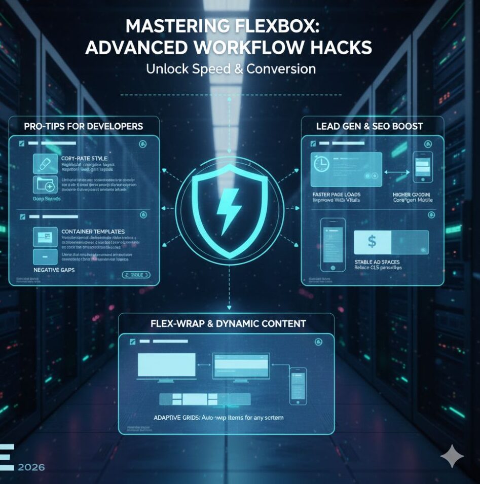
- The Copy-Paste Style Power: You can now copy the layout settings of one container and paste them onto another. If you’ve perfected a complex grid for a client’s portfolio, you don’t have to rebuild it. Just “Paste Style,” and your new Flexbox Containers inherit the direction, gaps, and padding instantly.
- Container Templates: I’ve started building a library of “Master Containers.” For example, a lead-gen hero section. By saving these as Elementor Templates, I can inject a fully responsive, Flexbox-optimized section into any new project in seconds.
- Negative Gaps: Did you know you can use negative values in the “Gap” setting? This is a secret weapon for overlapping design elements without using absolute positioning, which can often be finicky on tablet devices.
Why Google and AdSense Love Flexbox Containers
If you want AdSense approval or a high-earning blog, Core Web Vitals are critical. Flexbox Containers improve LCP and CLS because browsers calculate layouts before images load.
Unlike old columns that cause layout shifts, fixed-height or aspect-ratio containers create stable ad spaces, reducing CLS penalties and improving user experience and revenue.
Scaling Your Business with Lightweight Architecture
My reputation depends on client results. A slow Shopify store loses money. By migrating to Flexbox Containers, I’ve seen page load times drop 20–30%.
Faster sites improve landing page experience, lower ad CPC, and boost leads. Flexbox lets you use rich visuals and interactivity without sacrificing performance or profitability.
Mastering the “Flex-Wrap” for Dynamic Content
Flexbox Containers’ “Wrap” feature is often overlooked. Instead of manually setting items per breakpoint, you assign a minimum width and enable wrap.
The browser automatically adjusts five items on desktop, three on tablets, and one on mobile, creating fluid, intentional layouts that adapt naturally across all screen sizes.
The Psychology of Speed in Lead Generation
In my 11+ years, I have studied the psychology of the user. A user’s trust in a brand is directly proportional to how “solid” the website feels. If a site feels clunky or slow, the user subconsciously associates that with poor service.
By using Flexbox Containers, you eliminate the “jitter” of traditional page builders. The layout feels firm. When a user clicks a “Get Started” button that was positioned using a high-performance container, the transition is smoother.
These micro-interactions, powered by the lightweight nature of Flexbox, build the trust necessary to turn a casual browser into a qualified lead.
Future-Proofing with Flexbox
The web is moving toward a modular “component-based” future. Flexbox Containers are the first step in making Elementor truly component-ready.
As AI-driven design tools and new browsing hardware (like foldable phones) emerge, the flexibility of this container system ensures your site won’t break.
I always tell my fellow developers: “Build for the web of 2026, not 2016.” Using Sections and Columns today is like building a house with outdated materials.
Flexbox Containers are the modern steel beams that allow for taller, faster, and more creative structures.
About the Author: Bonny Elangbam
I am Bonny Elangbam, a seasoned Shopify developer and web architect with over 11 years of hands-on experience in the digital space. My journey has been defined by a passion for clean code, high-performance layouts, and helping businesses scale through superior UI/UX.
Having built hundreds of stores and sites, I specialize in migrating legacy structures into modern frameworks like Flexbox Containers to ensure my clients stay ahead of the curve. My goal is to bridge the gap between complex technical execution and intuitive user experience.
Take Control of Your Workflow
Mastering Flexbox Containers is no longer optional if you want to be a top-tier web creator. It is the bridge between “just another website” and a high-performance lead-generation machine.
By embracing this technology, you’re not just making your life easier; you’re providing a better experience for your users and better results for your clients. Over my 11+ years, I have seen many tools, but few offer the immediate ROI that Flexbox does.
Ready to transform your website performance? If you are looking to upgrade your current site to a high-speed, Flexbox-optimized powerhouse or need expert Shopify development, I am here to help. Contact me.
Will switching to Flexbox Containers break my existing Elementor site?
Elementor provides a conversion tool, but I always recommend backing up your site first. It converts Sections to Containers. You might need to do some minor padding adjustments, but the performance gains are worth it.
Are Flexbox Containers better for SEO?
Yes. Because they generate less HTML code, your site becomes more “crawlable” and loads faster, which are key ranking factors for search engines.
Do I need to know CSS to use Flexbox Containers?
Not at all. Elementor’s visual interface gives you all the power of CSS Flexbox through simple buttons and sliders.
Can I use both Sections and Containers on the same page?
While you can, it’s not recommended. For the best performance and consistency, it’s better to stick to one system throughout the page.
How do Flexbox Containers improve mobile speed?
By reducing the number of nested elements, the mobile browser spends less time calculating the layout, leading to a snappier feel for the user.